2019
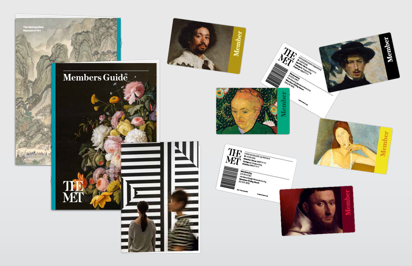
The Met
Blending food, art and technology on Fifth Ave.
Role
User Research, Personas
Wireframing, User Flow
Visual Design
Platforms
Mobile
Timeline
2 weeks
Team
Product Design
UX Research
NYC Sales Team
The Met approached Compass Digital Labs to help them conceptualize a digital product that could improve the visitor experience - primarily by helping visitors find places to eat. But the research told a different story. It seemed as though finding a place to eat wasn’t the only thing people wanted to do at The Met.
Understanding the stakeholders
One of the challenges with any project is balancing the interests of multiple stakeholders. But this project had three major players to satisfy.
The Met: Their primary interest is not only to provide a great experience to new and returning members but also to increase their membership, annual visitors, donation amounts, etc.
Compass Group: As a food service provider our goal was to create a wayfinding experience that would drive more visitors to Compass-owned restaurants at The Met.
Visitors: People visiting The Met have many goals but at the core, they want an enjoyable experience that revolves around enjoying the exhibits.

Distilling the research
Thanks to our research team we did have limited on-site research that had been conducted a few months prior to the project. From this we found that visitors to The Met fell into roughly two camps, the out-of-town visitor, and the local more frequent visitor.
Visitors to the Met fell into roughly two camps, the out-of-town visitor, and the local more frequent visitor.
The research was a mix of observational and interview data and from there we were able to generate proto-personas that would help guide final product decisions.


Rethinking the scope
Our initial mandate was to create a wayfinding product that would guide visitors to Compass-owned restaurants within The Met. But based on the primary research and some secondary research, we couldn’t just propose a product that guided people to food and expect a high adoption rate. So in the final product, there were considerations for integrating added features and functionality.
Since this was a client pitch, dev constraints and considerations were out of scope for this project
Since this was a client pitch, development constraints and considerations were out of scope, which was both slightly freeing but also intimidating. A blank canvas is often one of the hardest to start on.
Matching the brand
Since the leadership team would be presenting this pitch to The Met as a potential client, I tried to match the brand as closely as possible within the constraints that we had. The Met had recently undergone a rebrand, which translated across both its physical and digital spaces. Many of the decisions regarding the interface took inspiration from the client branding.


A home for members and visitors
Major features are quickly accessible from the home screen (Mapping, Search, Scan and Membership) users can quickly get what they need and go back to enjoying The Met.
A modular home screen content is more flexible based on user interest and data allowing for future scaling of features and personalization.
Exhibition, dining and art pages follow the same structure, I did this to reduce the time taken to learn how the app works. In the future, I’d like to test to see if these designs really do reduce the time it takes to navigate through the app.

Finding art you actually care about
The Met has more than 2 million pieces in its permanent collection, with an extensive online archive documenting a large portion of the collection. With 400,000+ images along with supporting descriptions and details.
Aggregate data of popular pieces (collected through scanning data) could also help The Met understand user behaviour and trends to better serve patrons over time.
Adding a search was key to the experience, especially since most visitors were shy to ask for help from Met staff. There was a feeling as though staff were trying to sell visitors something when in reality they were there to help.


Dude, where’s my Monet?
The original request from Compass Group was to create a wayfinding solution that would help guests navigate The Met’s vast interior. Making a feature like this technologically feasible would require a massive investment in Bluetooth beacon infrastructure on The Met’s part.
Guests could find their way to exhibits, specific pieces of art or auxiliary services provided by The Met including Information desks, washrooms and most importantly restaurants.


Conclusion
By adding a couple of new features alongside the initial ask my intent was to conceptualize a product that didn’t only appeal to corporate stakeholders, but to the average art enthusiast as well.
My intent was to conceptualize a product that didn’t only appeal to corporate stakeholders, but to the average art enthusiast.
Creating something that benefited both the one-time visitor as well as the long-time member was a challenging balancing act. Given more time and resources, it would be interesting to see how the features and design choices would impact these user groups.